The goals of this lab are:
First we will apply PCA to a classic dataset of Iris flowers. This dataset is actually built-in to the package we will use: sklearn. If you do not already have this library, install it using pip3:
pip3 install sklearnIf this doesn’t work, it may be that you have multiple versions of Python 3. In that case run:
python3 -m pip3 install sklearnWrite your code in the file pca_iris.py. Begin by importing the necessary packages:
import numpy as np
import matplotlib.pyplot as plt

from sklearn import decomposition
from sklearn import datasets
The documentation for the PCA module can be found here.
The datasets module contains some example datasets, so we don’t have to download them. To load the Iris dataset, use:
iris = datasets.load_iris()
X = iris.data
y = iris.target
X is our nxp matrix, where n=150 samples and p=4 features. Print X. The features in this case are not DNA data, but physical features of the flowers:
Our goal here is to use PCA to visualize this data (since we cannot view the points in 4D!) Through the process of visualization, we’ll see if our data can be clustered based on the features above.
Now print y. These are the labels of each sample (subspecies of flower in this case). They are called:
y is not used in PCA, it is only used afterward to visualize any clustering apparent in the results.
Using the PCA documentation, create an instance of PCA with 2 components, then “fit” it using only X. Then use the transform method to transform the features (X) into 2D. (3 lines of code, but make sure you know what each line is doing!)
Now we will use matplotlib to plot the results in 2D, as a scatter plot. The scatter function takes in a list of x-coordinates, a list of y-coordinates, and a list of colors for each point. Here the two axes are PC1 and PC2, and the points to plot are formed from the first and second columns of the transformed data.
plt.scatter(x_coordinates, y_coordinates, c=colors) # exampleFirst plot without the colors to see what you get. Make sure to include axis labels and a title.
Then create a color dictionary that maps each label to a chosen color. Some colors have 1-letter abbreviations.
There is also a longer list of named colors here. After creating a color dictionary, use it to create a list of colors for all the points (thinking about what colors are easily distinguishable), then pass that in to your scatter method.
Legends are often created automatically in matplotlib, but for a scatter plot it’s a bit more difficult. We’ll actually create more plotting objects with no points, and then use these for our legend. Consider the code below. For each color, we’re creating a null-plot (the 'o' means use circles for plotting). Then we’re mapping these null objects to names of the flowers (create a list of names for each class).
# create legend
leg_objects = []
for i in range(3):
    circle, = plt.plot([], 'o', c=color_dict[i])
    leg_objects.append(circle)
plt.legend(leg_objects,names)
At the end, you should produce and save a plot called figures/iris.pdf (make sure to add/commit/push this figure).
figures/iris.pdf
Now we will apply PCA to human data. For this part you will likely need to work on the lab computers, as the data file is very large (6Gb). You are welcome to copy it to your own computer though if you have enough space. The file is at the path:
/homes/smathieson/Public/1000g/ALL.chr2_start.vcfThis file contains about 10% of chromosome 2, for all samples in the 1000 Genomes Project Phase 3. It contains about 600,000 SNPs. View the file using less:
less /homes/smathieson/Public/1000g/ALL.chr2_start.vcfHit the space bar until you see the actual codes for each individual (starting with HG00096). Then continue going down until you see the actual data. The second line of actual SNP data (the first line is a bit different) starts with:
2 10180 rs564086017 A CThis means we are on chromosome 2, at location 10180 in the genome, and a “0” means “A” (reference base) and a “1” means “C” (alternative base). Each individual has two copies of this site (one from each parent). For example, “0|0” means the individual has two “A’s” at this location. We can see that most people have two “A’s” at this base, but a few have one “A” and one “C”. Most sites in the genome are non-variable (everyone is the same), so we only store the sites that are different.
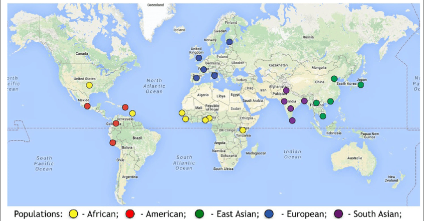
We will also make use of the file that maps each individual sample to its “super-population” (AFR, AMR, EAS, EUR, and SAS). See the image below for an overview of these super-populations.
/homes/smathieson/Public/1000g/igsr_samples.tsv
Source: 1000 Genomes Project
The starter code pca_human.py contains a VCF file parser which takes in the following arguments:
def parse_vcf(filename, sample_dict, n, p):You should experiment with n (number of samples), and p (number of SNPs). These are also command line arguments to the script (the -o option is for the output file):
python3 pca_human.py -v /homes/smathieson/Public/1000g/ALL.chr2_start.vcf
   -s /homes/smathieson/Public/1000g/igsr_samples.tsv -n 20 -p 1000 -o figures/human.pdf
First, create a sample_dict which maps each sample to its super-population (use the igsr_samples.tsv file, which is tab-separated).
Pass this into the VCF parser, which will return a list of super population names as well as the matrix X which is nxp. Then run PCA on this matrix using a similar method to the Iris dataset.
Finally, plot PC1 and PC2 as before, using the 1000 genomes color-coding for each super population. Keep experimenting with different values for n and p - try to use the largest numbers you can, but make sure plotting is working first since this can take a long time to run. You should start to see some clustering of the individuals in each population. Save your final plot (including legend, axis labels, title, etc) as:
figures/human.pdf
For the iris flower dataset, what genealogical relationships can we infer from the PCA plot?
For the human dataset, what fraction of the variance is explained by the first PC? By the second? (Hint: see PCA documentation)
For the human dataset, what genealogical relationships can we infer from PC1 and PC2?
(Optional) Plot PC3 and PC4 on a separate plot. What genealogical relationships can we infer from these PCs?
Feedback from Allison Gong helped refine this lab.