Goals:
numpy, plotting) on larger datasetsCredit: Based on materials created by Allison Gong. Climate dataset and plots based on teaching materials from Gary Witt of Temple University. Regression dataset from Jessica Wu of Harvey Mudd College.
Accept your Lab 2 repository on Github classroom. You should have the following folders/files:
model_analysis.pysea_ice_1979-2012.csv, sea_ice_2013-2020.csv, regression_train.csv, regression_test.csv (in the data folder)README.md for your lab writeupNote: all code for this lab can be written in model_analysis.py, and all results/plots should be recreated by running this file on the command line:
python3 model_analysis.py(It is okay to hard-code file names just for this week. We will see how to make input more flexible next week.)
First open up the file data/sea_ice_1979-2012.csv and make sure the file makes sense. The first column is the year and the second is the September sea ice extent, measured in millions of square kilometers. Then using what you learned in the matplotlib tutorial last week, create a plot of this data (with axis labels and a title). Make sure the y-axis starts at 0.
Create a folder called figures and save your plot in this folder as part1.pdf.
Now we will consider two different models for this dataset. The first is a linear model (degree 1 polynomial) and the second is a quadratic model (degree 2 polynomial). The coefficients for these two models are shown below:
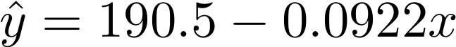
deg_1_coef = [190.5038227644984, -0.09224446142042844]

deg_2_coef = [-15150.155305067638, 15.283380627913214, -0.0038525745647042583]
For example, the first model can be written like this:
In later weeks we will see how to actually fit a model to data to obtain this type of output. For this part of the lab, first devise a way plot each polynomial on top of the data. It is okay to copy the coefficients above into your code, but try to avoid any duplicated code. Save your plots as:
figures/part2_deg1.pdffigures/part2_deg2.pdfNow we will plot the residuals (i.e. the true y-value minus the predicted y-value based on the model). Devise a way to compute these residuals for each data point, then plot them against the original x-values. Again make sure to think about good python style and avoid duplicated code. You can also use plt.clf() to clear all plotted information and start again. Save your plots as:
figures/part2_residuals1.pdffigures/part2_residuals2.pdfIn your README.md, describe the patterns you see in the residuals. Based on these patterns, which model do you think is a better fit for this data?
In this next part of the lab we will see how these models can be used for predicting future patterns. Investigate the file data/sea_ice_2013-2020.csv. During 2012, none of these values were known, and models such as the ones above were used to predict future sea ice extents. Now we will see how accurate these predictions were.
For each model (linear and quadratic), plot this new dataset in addition to the original dataset and the model (each in a different color). Save your plots as:
figures/part3_pred1.pdffigures/part3_pred2.pdfIn your README.md, describe what you observe. Based on these visualizations, which model do you think is a better fit? How would you advise governments who are trying to make policy decisions based on this type of model fitting process?
Above we have seen two different ways to select a model (residuals and a held-aside “test” dataset). A third way is demonstrated in Part 4.
For this step we will use a different dataset data/regression_train.csv (this is a toy dataset just for the learning purposes).
See the end of the README.md file for coefficients for 11 different polynomial models. Using a loop, create a plot of each model along with the training data. Try to make your code as flexible as possible. Save at least 3 representative figures in your figures folder as:
figures/part4_degn.pdf (for at least 3 n values)You should be able to run this part with this command line:
python3 model_analysis.pyIn your README.md describe the pattern you observe. Based on these preliminary visualizations, which model would you choose and why?
Now we will create what is called an “elbow” plot. The x-axis it the degree of the polynomial, and the y-axis is the RSS or “residual sum of squares”. So for each polynomial, compute the RSS by squaring each residual and adding them all up. Then plot this against the degree. Save your figure as
figures/part4_elbow.pdfAfter creating such a plot, we observe when the RSS has started to plateau, and use the smallest degree after this point. Looking at this plot, what would you choose? Explain your answer in your README.md.
README.md is completely filled out. Points will be lost for not filling out the last section.Devise a way to use data/regression_test.csv to be more precise about model selection. Explain how your method might be more precise. Describe your results in your README.md.
Plot the residuals for some of the models in Part 4. Based on your results, which model would you choose and why?