The goals of this lab are:
In this lab we will explore K-means, a very popular clustering algorithm. We will use the same data as for Lab 1, which is labeled (zip code data):
/home/smathieson/public/cs66/zip/zip.test
/home/smathieson/public/cs66/zip/zip.train
To train the model however, we will not use the labels (which makes this method unsupervised learning). But since we have them, we have an additional way of assessing accuracy.
K-means is implemented in sklearn; first investigate the documentation.
Look at the arguments that can be passed in to the constructor for K-means. The most important for this lab will be n_clusters. Also look at the available methods. We will use fit and predict, but only passing in the features (i.e. X).
Create a new file called kmeans.py. We will be using the same zip code data, so copy over the code that reads in this data and filters it for just the data points with label 2 or 3. Also make sure that you’ve removed the first column (y) and stored it separately from the features (X). Only the features should be passed into K-means. If you have an accuracy function that takes in the true labels and predicted labels, copy that over as well.
Create an instance of the KMeans class, passing in the desired number of clusters (try out K matching the number of classes you retained, and K not matching this number). Then use the fit method with the training data, which will determine the cluster centers.
After this, use the predict method on the test data to predict the cluster membership of each test example. Since we do have labels in this case, we can evaluate the accuracy of this prediction. Pass in the output of predict and the true training labels into your accuracy method (or write an accuracy method) and print the result. Why might your accuracy be very low?
So far, we have just considered two classes, but now we are in a position to consider all of them. Perform the same analysis with the unfiltered dataset. What changes need to be made? Again assess the accuracy. It is probably very low. Why is that? How can you post-process the K-means labels to properly consider the accuracy?
Next we will be visualizing a Gaussian Mixture Model (GMM) with different covariance matrices.
Credit: based on this Iris flower clustering exercise.
First, download gmm.py and look at the code. First load this data to obtain X and y, as shown below. Run the code and make sure the scatter plot shows up.
iris = datasets.load_iris()
X = iris.data
y = iris.targetThe next step is to create the Gaussian mixture model and fit it to our data. Here is the GMM documentation.
Create an instance and then use fit with our features X. Use 3 components and the argument:
covariance_type='spherical' # use spherical covariances to startAfter fitting the model, print the means and covariances. Make sure the dimensions make sense.
Using the function provided, we can visualize the covariances. To call this method, pass in your GMM object, as well as the “axes” for your graph.
make_ellipses(gaussian_mixture_model, ax) # pass in your model objectMake sure you can visualize the results. The colors might not match up correctly (you could run it a few times until they do) since this is an unsupervised learning approach. Does this agree with our notion of a spherical covariance matrix?
Now change the covariance matrix type to diag (diagonal covariance matrix) and run the results again. Does this look like a better or worse fit? Do the same thing for full and tied and comment on the results.
Finally we will apply PCA to a classic dataset of Iris flowers. This dataset is actually built-in to the package we will use: sklearn. To use this module, we will need to work in the virtual machine for our class:
Create a new python file pca_iris.py and import the necessary packages:
import numpy as np
import matplotlib.pyplot as plt

from sklearn import decomposition
from sklearn import datasets
The documentation for the PCA module can be found here.
The datasets module contains some example datasets, so we don’t have to download them. To load the Iris dataset, use:
iris = datasets.load_iris()
X = iris.data
y = iris.target
X is our nxp matrix, where n=150 samples and p=4 features. Print X. The features in this case are physical features of the flowers:
Our goal here is to use PCA to visualize this data (since we cannot view the points in 4D!) Through the process of visualization, we’ll see if our data can be clustered based on the features above.
Now print y. These are the labels of each sample (subspecies of flower in this case). They are called:
y is not used in PCA, it is only used afterward to visualize any clustering apparent in the results.
Using the PCA documentation, create an instance of PCA with 2 components, then “fit” it using only X. Then use the transform method to transform the features (X) into 2D. (3 lines of code!)
Now we will use matplotlib to plot the results in 2D, as a scatter plot. The scatter function takes in a list of x-coordinates, a list of y-coordinates, and a list of colors for each point. Here the two axes are PC1 and PC2, and the points to plot are formed from the first and second columns of the transformed data.
plt.scatter(x_coordinates, y_coordinates, c=colors) # exampleFirst plot without the colors to see what you get. Then create a color dictionary that maps each label to a chosen color. Some colors have 1-letter abbreviations.
After creating a color dictionary, use it to create a list of colors for all the points, then pass that in to your scatter method.
Legends are often created automatically in matplotlib, but for a scatter plot it’s a bit more difficult. We’ll actually create more plotting objects with no points, and then use these for our legend. Consider the code below. For each color, we’re creating a null-plot (the ‘o’ means use circles for plotting). Then we’re mapping these null objects to names of the flowers (create a list of names for each class).
# create legend
leg_objects = []
for i in range(3):
circle, = plt.plot([], color_dict[i] + 'o')
leg_objects.append(circle)
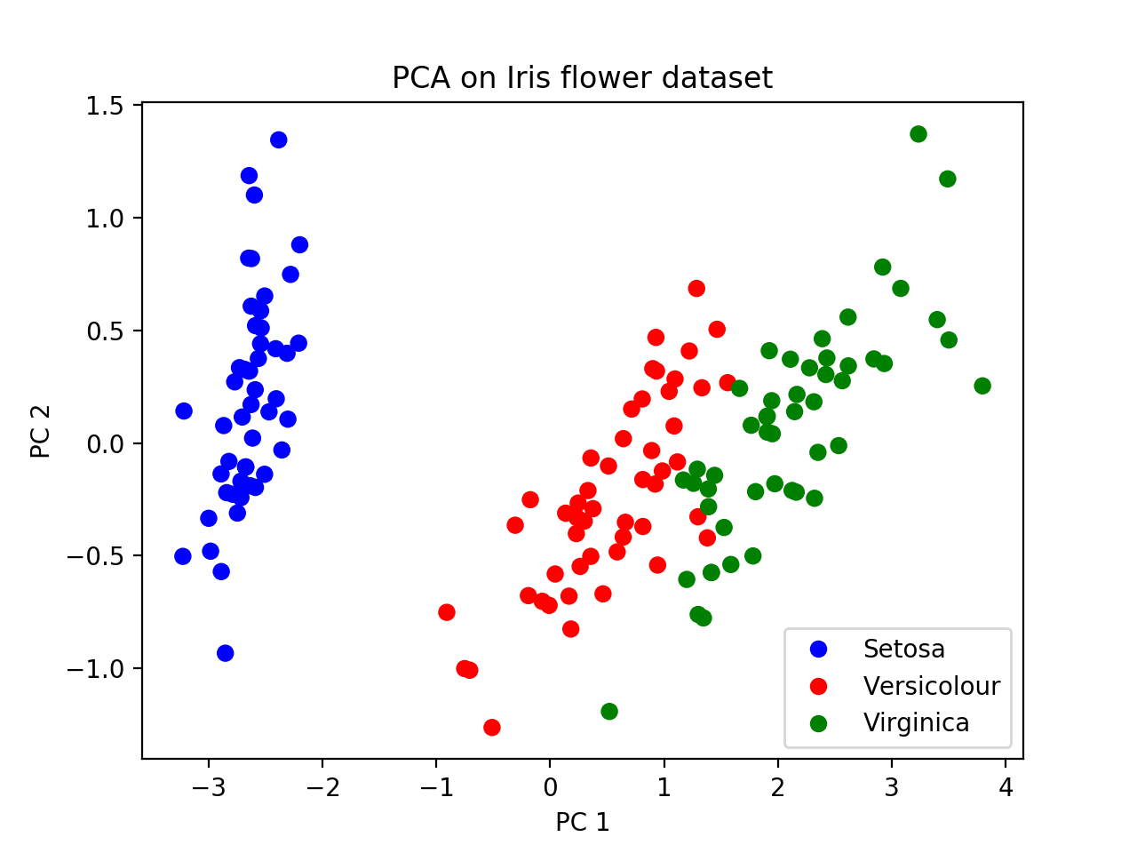
plt.legend(leg_objects,names)At the end, you should get a picture like this. We can see that Setosa is further away from the other two subspecies with respect to PC1, suggesting that a tree relating these groups would have Versicolour and Virginica joining together first (i.e. most recently), and then finding a common ancestor with Setosa more anciently. This is the “genealogical interpretation of PCA”.
Create an “elbow plot” for K-means. Does your “best” K match the true number of clusters? (could be 2 if you filtered, or 10 if you didn’t)
Apply both K-means and GMMs to the same dataset (i.e. either choose the zip code or the Iris flower dataset). Comment on the method comparison.
For PCA, what fraction of the variance is explained by the first PC? By the second? (Hint: see PCA documentation)