CSC 390: Topics in Artificial Intelligence
Lab 3: PCA
in-class
For this lab, please work with your randomly assigned partner, with code on one computer. Make sure to email each other the code afterwards, since we will use a similar method for the next homework.
Step 1: Get the data
Create a new python file and use the following imports:import numpy as np import matplotlib.pyplot as plt from sklearn import decomposition from sklearn import datasetsThe documentation for the PCA module we'll be using can be found here.
The datasets module contains some example datasets, so we don't have to download them. To load the Iris dataset, use:
iris = datasets.load_iris()
X = iris.data
y = iris.target
Similarly to k-means, we again have features X and labels y. We will not use y in fitting the model (unsupervised learning), but we can use y later on to evaluate the model fit. Print X. X should have 4 features for each of 150 examples. These features are:
- sepal length in cm
- sepal width in cm
- petal length in cm
- petal width in cm
Now print y. These are the labels of each example (class or subspecies of each flower). They are called:
- Iris Setosa (label 0)
- Iris Versicolour (label 1)
- Iris Virginica (label 2)
Step 2: Fit the model
Using the PCA documentation, create an instance of PCA with 2 components, then fit it using only X. Then use the transform method to transform the features (X) into 2D. The code probably looks quite similar to k-means or other methods we've used in sklearn. The code structure is the same, but the "fitting" procedure is very different.
Step 3: Plot the results
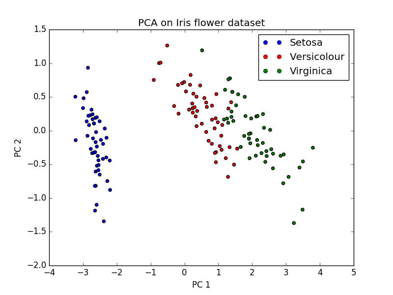
Now we will use matplotlib to plot the results in 2D, as a scatter plot. The scatter function takes in a list of x-coordinates (PC1 here), a list of y-coordinates (PC2 here), and a list of colors for each point.
plt.scatter(x_coordinates, y_coordinates, c=colors) # example
plt.show() # open the plot in a new window
What should the arguments be in this case? First plot without the colors to see what you get. Then create a color dictionary that maps each label to a chosen color. Some colors have 1-letter abbreviations.
- b: blue
- g: green
- r: red
- c: cyan
- m: magenta
- y: yellow
- k: black
- w: white
color_dict = {0: 'b'}
After creating a color dictionary, use a single line list comprehension to create a list of colors, one for each data point. Then pass this list into your scatter function.
Step 4: Plotting extras
We can also label our axes and create a plot title. Pass strings into each of the following methods:
plt.xlabel('xaxis_label')
plt.ylabel('yaxis_label')
plt.title('my_title')
Step 5: Create a legend (optional)
Legends are often created automatically in matplotlib, but for a scatter plot it's a bit more difficult. We'll actually create more plotting objects with no points, and then use these for our legend. Consider the code below. For each color, we're creating a null-plot (the 'o' means use circles for plotting). Then we're mapping these null objects to names of the flowers (create a list of names for each class).
# create legend
leg_objects = []
for i in range(3):
    circle, = plt.plot([], color_dict[i] + 'o')
    leg_objects.append(circle)
plt.legend(leg_objects,names)
Example figure: